Celine News
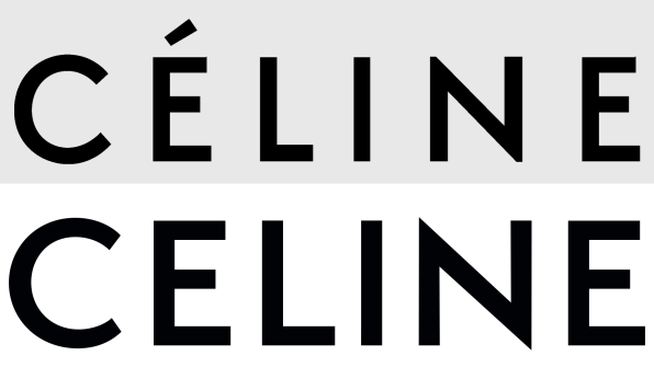
Goodbye Céline, hello Celine. The LVMH-owned fashion label unveiled a new logo over Labor Day weekend, and the internet is very divided about the typographic facelift.
On Monday, weeks ahead of his debut collection for the brand, incoming creative director Hedi Slimane brashly announced the start of his era with a ceremonious Instagram purge that wiped the entire official @celine account clean, replacing it with a three–part post announcing a newly refreshed brand identity. In short: The accent over the E is now gone, and the letter spacing has been finessed for visual consistency. Fashion insiders and stans alike promptly went into mourning over the former look of the luxury fashion house. Users griped and ranted that “The new Celine sounds cheap and tacky,” and “NO ACCENT NO CÉLINE,” while another simply proclaimed: “R.I.P. Céline.”

This would be the second time Slimane, who most recently headed Yves Saint Laurent, upset the apple cart by tweaking a legacy logo design. Then, he retired the famous YSL mark, originally drawn by the painter Adolphe Mouron Cassandre in 1961, by trading its serif strokes for Helvetica and shortening the label’s name to simply Saint Laurent.
While it may seem odd and even a bit surreal to hear the fashion crowd get their garments bunched over topics as arcane as kerning, diacritical marks, and vintage typefaces, logos hold a heightened role in the luxury fashion world, and for good reason: They’re often the face of accessories, the cash cow of the luxury goods industry. Plastered on handbags and accessories, packaging for beauty products, and lower-end tees and products that drive the bottom line, the blueprint of a heritage logo seemingly upholds the aura of authenticity for luxury fashion brands, even as it feeds the aspirational beast that spawns poorly botched imitations and counterfeits. If you’re spending thousands on a luxury item, you’re bound to know the real thing—down to the embroidery, buttons, seams, zippers, and, yes, logo—to a tee. For some items, including Celine’s own infamous $600 plastic bag that trended this spring, an authentic logo is what mostly distinguishes the item from a plain ol’ pile of PVC.
Beyond product, logos today also need to operate across a plethora of distribution channels. As Chris Wu, a partner at the design studio Wkshps, explains, this means an apt logo “needs to be no-fuss and bulletproof. It can appear on a tiny avatar and still look clear and sharp; it needs to render well and remain recognizable in the background in a video or 1-second animated gif,” he said, and it even “needs to be easy enough for fans or haters to pull out and create internet memes and in a distorted and unconsidered setup.” For Wu, the removal of the accent over the E strategically acknowledges a more global demographic. “I see a clear nod to the intrinsic nature of digital communication and globalism. A brand today not only needs to be recognized, but also discussed, shared, and eventually, typed out. I wonder how many people ever deliberately type out the accent é when they share their new Céline bag in a social media post.”
For longtime collectors of Celine wares, news of the logo redesign both egotistically dates last season’s bag to a pre-Slimane era, and aims to generate hype for a demographic of shoppers frenzied over Instagram feeds. (A video of the same golden curtain also features on the brand’s site celine.com, with the addition of a small countdown clock to Slimane’s show at Paris Fashion Week in 23 days, measured by the hours, minutes, and seconds.) It may be that monograms, long regarded as the lifeline and currency of longevity for some luxury fashion brands, are an old-fashioned signifier of rarified exclusivity that’s less relevant to today’s digitally driven culture, where the quest for continual newness trumps tradition, and the notion of buying a future heirloom seems a little quaint (and perhaps even naive, because #latecapitalism).
British designer Peter Saville, lauded for his album covers for bands like Joy Division, was recently criticized on social media for his redesign of Burberry’s heritage word mark and tessellated monogram; he also redesigned the Calvin Klein logo last year. And the cuttingly ironic collections of Balenciaga of late, led by Vetements’ Demna Gvasalia, sarcastically pepper garments with a sense of parody, aping and recycling the familiar look of brand logos ranging from DHL to Bernie Sanders’s 2016 presidential campaign.
For a visually saturated digital landscape, logos are but avatars teeming for our attention—even as they fall into an increasingly homogenized style. “The tighter letter spacing feels like an improvement from the original design, but we miss that bit of uniqueness and context that came from having the accent over the E,” says David Heasty, who runs the graphic design studio Triboro with his wife and partner, Stefanie
https://www.fastcompany.com/90231578/celines-new-logo-is-tearing-fashion-fans-apart

ii7sxz